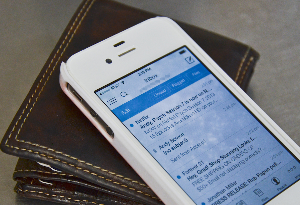
Is a particular email experience reason enough to switch smartphones, or even platforms? For me, the answer was yes. I recently retired my iPhone 4s and began using the native Android Gmail app on an HTC One. Why? Here are just two reasons: I can archive or respond to emails from the lock screen (thanks, Jelly Bean), and the One’s 4.7-inch display allows for a more encompassing view of my 70-some-odd labels. Needless to say, email is super important to me. So when Acompli launched last week with the tagline “iPhone Email Just Got a Promotion,” I decided to wipe the dust off my 4s and take it for a spin.
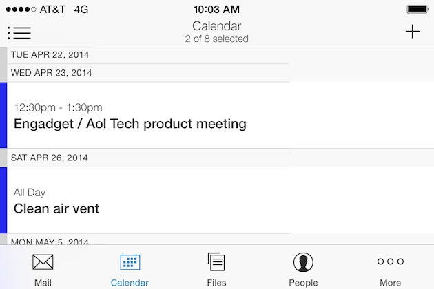
The fundamental difference between Acompli and Mailbox or Gmail is that it has three integrated hubs: “Calendar,” “Files” and “People,” each with its own tab at the bottom of the screen. Pull up the calendar and you’re greeted with a quasi-agenda view, similar to what you’ll find in iOS 7. There, you can add dates to any imported calendar without leaving the app. Switching between tabs isn’t much faster than bouncing between different applications, but I’ve noticed the pure convenience causes me to glance through my schedule much more than before, which is a wonderful thing. From the People and File hubs I can sort through — you guessed it — contacts and files included in recent email conversations. Essentially, they both provide a clean approach to filtering through the content of your emails. For example, earlier this morning I shared several sheet music PDFs (originally sent from my wife) with other band members without having to dig through the email itself. Nifty.

And what email app would be complete without the swipe? Yes, Mailbox users can already delete and archive emails by swiping from left to right, but for some reason that direction rubs me the wrong way. It just feels better to swipe from right to left, as is the case with Acompli. Additionally, you only have to swipe your thumb halfway across the screen to incur the delete option, compared to three-quarters of the screen with Mailbox. If you have shorter fingers like me, you’ll understand why that’s awesome. I will say thumbing emails around in Acompli is actually quite speedy, though I often opt for the mass-edit option and kill ’em off by the multitudes.
It’s also worth mentioning that Acompli has true Gmail label support, meaning it doesn’t arbitrarily add labels the way Mail Pilot does. I can choose between my unified inbox and connected accounts in a straightforward, floating menu, with each of my labels listed chronologically below. Acompli also doesn’t attempt to indent nested labels when viewing them. For most that may not be a problem, but when you have a bajillion labels to deal with, it makes a difference.
So, was my experience with Acompli powerful enough to uproot my allegiance to Gmail on an Android phone? Again, the answer is yes — at least for the time being. It works well enough to make me forgot I’m using a 3.5-inch display and, admittedly, I’m a sucker for its minimalistic, two-tone UI. Has Acompli revolutionized mobile email, though? No, but it can be a speedy and powerful tool if you’re willing to take the time to learn its nuances.


Leave a Reply
You must be logged in to post a comment.